The Famous Blue Shirt: Evolution of Chelsea’s Kits The history of Chelsea’s iconic blue jersey
The Famous Blue Shirt: Evolution of Chelsea’s Kits The history of Chelsea’s iconic blue jersey
The story of Chelsea Football Club's blue jersey is full of tradition, innovation, and fan loyalty. Since 1905, the club's kits have changed with the times. They show the team's journey and its lasting identity.

Chelsea started in 1905 and joined Division Two that year. Their first kit was Eton blue and white, the colors of the Earl of Cadogan, the club's president. Despite being called "The Pensioners," the team never wore red uniforms like the Chelsea Pensioners veterans.
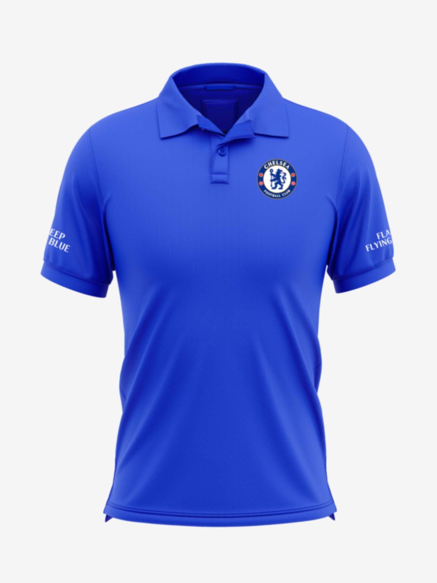
Over the years, Chelsea's home jersey has stayed true to its blue color. This color is key to the club's identity. The jersey's design has changed with the times, but it always kept the blue and white colors.
From its early days to now, Chelsea's jerseys tell a story of the club's proud history. They show Chelsea's lasting place in English football.
The Origins: Racing Colors of the Earl of Cadogan
Chelsea Football Club's famous chelsea blue jersey has deep roots in the club's history. The team's first colors were Eton blue and white. These colors were linked to the Earl of Cadogan, the club's first president.
Over time, Chelsea changed to the chelsea colors we know today, royal blue. The first mention of "blue and white" jerseys was in a 1919 match program. It was from a game against Lincoln City on October 13, 1906.
The Nickname "The Pensioners" and Its Influence
Chelsea is also known as "The Pensioners." This name comes from the chelsea pensioners, war veterans living at the Royal Hospital Chelsea. But the team never wore the red uniforms of these veterans.
"The switch to the distinctive chelsea colors of royal blue is believed to have occurred at various points throughout the club's early years."

The story of Chelsea's kit is intriguing. It shows the club's history and its love for the chelsea blue jersey. From Eton blue and white to royal blue, the colors symbolize pride and passion for fans.
Establishing the Royal Blue Identity (1930s)
In the 1930s, Chelsea Football Club made royal blue a key part of their look. They chose royal blue shirts with rugby-style collars, white shorts, and black socks with blue and white details. This look stayed the same for 25 years, making Chelsea's royal blue a symbol.
The club picked royal blue to match the Earl of Cadogan's racing colors. He owned the land where Stamford Bridge stadium is. This blue and white combo became Chelsea's signature, helping the club grow famous.
"The royal blue and white color scheme became the iconic Chelsea identity."
By the 1930s, Chelsea's blue jerseys, white shorts, and black socks with blue details were well-known. This classic chelsea uniform helped shape the club's image. The royal blue became a symbol of pride for the team and fans.

The chelsea royal blue jersey is still loved today. Chelsea's success made their royal blue and white colors a key part of their brand. Over time, the design has changed, but the essence of their look has stayed the same.
The Ted Drake Era and the First League Title (1950s)
In 1952, Chelsea welcomed Ted Drake as their new manager. He quickly made changes to the club. One of his first actions was to introduce a new crest, a modern monogram on a shield. This change started a new chapter for Chelsea.
The 1955 Championship-Winning Kit
Under Drake, Chelsea's team won the League Championship for the first time in 1955. They wore royal blue shirts, white knickers, and black stockings. This chelsea championship kit made Chelsea a top team in English football.

"The 1955 championship-winning kit is a testament to Chelsea's enduring legacy and the club's ability to adapt and thrive in the face of change."
The chelsea crest changed, but the team's spirit and determination stayed strong. This win was a big step for Chelsea. It set the stage for future successes and made the club a legend in English football.
The Iconic 1960s: Blue Shirts, White Shorts, and Blue Socks
Chelsea's kits in the 1960s were known for their blue shirts, white shorts, and blue socks. This look became a key part of the club's identity. The club's chelsea lion crest was introduced in 1960. It showed a lion from the first president's arms, the Earl of Cadogan.
The Emergence of the Lion Crest
The chelsea lion crest was a big deal for the club. It was inspired by Chelsea's London Borough coat of arms. This crest showed the team's pride and history, making the chelsea 1960s kit stand out.

In the successful 1960s, the blue shirts, white shorts, and blue socks became Chelsea's signature look. This look helped the team become a key part of English football history. The chelsea 1960s kit and crest are still loved by fans today.
Evolution of Chelsea's Football Kits
The evolution of Chelsea's football kits is a story of style and tradition. In the 1960s and 1970s, the iconic blue jersey changed a lot. It got white trim and a new cypher, replacing the old Cadogan crest.
Cup-Winning Kits of the 1970s
In the 1970-71 season, Chelsea's kit got a big update. A small image of the FA Cup was added next to the crest, celebrating their cup win. Two stars also appeared on the jersey, showing off their FA Cup and European Cup-Winners' Cup victories.
Later, in the 1973-74 and 1974-75 seasons, Chelsea tried out white shorts and black socks with blue and white turns. This added some variety to their classic chelsea kits evolution.

"The evolution of Chelsea's kits reflects the team's diverse history and connection to fans through fashion and sport."
The 1970s were a big time for Chelsea. The club worked on its identity and made its mark in football. The kits from this decade show the team's strength and style on and off the field.
The Ups and Downs of the 1980s and Early 1990s
The 1980s and early 1990s were a time of ups and downs for Chelsea FC. The club wanted to refresh its image and identity. It made big changes in kit design and marketing.
The Introduction of the Chelsea Collection
In the mid-1980s, Chelsea's board aimed to change the club's image. They introduced a new crest with a leaping lion over "CFC." Chelsea was the first to market its strips as the Chelsea Collection. These kits first had no sponsor, then had logos from Bai Lin Tea and Grange Farm.
The Chelsea Collection changed how the club designed and branded its kits. By controlling its merchandise, Chelsea wanted to bond more with fans and stand out in English football.

The 1980s and early 1990s were challenging for Chelsea, with ups and downs on the field. Yet, the Chelsea Collection showed the club's smart vision and wish to keep a unique identity that fans would love.
The Russian Revolution: Abramovich's Era (2003 Onwards)
In 2003, Roman Abramovich, a Russian billionaire, changed the game for Chelsea Football Club. His big money brought a new era of success. This let the Blues sign top players and win back-to-back Premier League titles in 2005 and 2007.
Signing Global Stars and Winning Premier League Titles
Abramovich's rule meant big spending and bringing in stars like Didier Drogba, Frank Lampard, and John Terry. These stars, with the team's smart tactics, made Chelsea the top team in English football. They became a top force in the chelsea abramovich era.
The New Crest and Nike Partnership
Along with winning games, Chelsea got a new look. The club's crest got a modern update. They also started a big chelsea nike partnership. This made Chelsea one of the top sports brands worldwide.
The Abramovich era has made a lasting impact on Chelsea. It brought huge success and global fame to the club.

"Chelsea's transformation under Abramovich's leadership has been nothing short of remarkable. The club's ability to attract world-class talent and secure major titles has solidified their place among the elite of European football."
Nike's Innovative Designs in the 2010s
In the 2010s, Nike made big strides with Chelsea's kits. They brought new and modern designs that honored Chelsea's blue jersey and history. Nike's focus on technology and design led to some of the most striking and useful kits for the club.
Nike's designs were all about using the latest materials and techniques. This made the kits better for players and helped them move faster on the field. Their AeroSwift technology was a big step forward. It used single-knit and double-knit fabrics to make the kits more breathable and structured.
- The AeroSwift design used single knits for areas needing motion and breathability. Double knits were for structure, helping with ventilation.
- Nike's new yarn technology made sweat evaporate 20% faster and dry 25% quicker. This kept players cool and dry during games.
- The kits were 10% lighter and stretched 50% more, giving players more movement and less fatigue during games.
The partnership between Chelsea and Nike started in 2017 and has brought amazing kits. These kits have wowed fans and critics. They mix the club's history with Nike's innovation, making Chelsea stand out in the Premier League.
"Nike's designs have taken Chelsea's kits to new heights, combining our storied traditions with cutting-edge technology and style. The chelsea nike kits have become a source of immense pride for our players and supporters alike."
As Chelsea moves forward, their partnership with Nike will bring more exciting designs. These will surely win the hearts of football fans everywhere.

Celebrating Tradition and Innovation in the 2020s
Chelsea Football Club has found a great balance between tradition and innovation in the 2020s. Their chelsea 2020s kits honor the team's legendary blue jersey. At the same time, they bring fresh, modern looks to football kit designs.
The 2020/21 season introduced a sleek, modern home kit. It kept the royal blue color but added a subtle diamond pattern. This design respects the club's history while also attracting new fans.
The away kits have been especially exciting, with bold and new designs. One kit had a gradient pattern that mixed blue and white beautifully. It made the kit stand out on the field.
"Chelsea's kit designs in the 2020s have been a testament to the club's ability to balance tradition and innovation. They've managed to honor their iconic blue jersey while introducing fresh, contemporary elements that keep the brand feeling modern and relevant."
Chelsea doesn't just focus on the kits. They also offer unique digital experiences, like limited-edition NFTs. These let fans own a digital piece of the club's history.
Chelsea keeps setting new trends in football fashion with their chelsea 2020s kits. They mix their chelsea tradition and innovation perfectly.

The Enduring Appeal of the Blue Jersey
The chelsea blue jersey is a symbol of Chelsea Football Club, loved by fans across generations. It's the chelsea iconic kit that brings pride and unity to the Blues fans.

Through Chelsea's history, the blue jersey has stayed constant. It has seen the team's highs and lows. From being "The Pensioners" to Premier League champions, the blue shirt has always been there.
"The blue jersey is more than just a uniform; it's a badge of honor that we wear with pride. It connects us to the history and tradition of this great club."
The chelsea blue jersey shows how loyal Chelsea fans are. Even in today's world where kits are seen as fashion, the blue shirt stays a classic. Fans always want the latest versions.
The chelsea iconic kit goes beyond the game. It shows the club's global reach and cultural impact. Fans worldwide, from Los Angeles to Tokyo, proudly wear the blue jersey.
The chelsea blue jersey shows the club's history, fan dedication, and the power of football. As Chelsea makes new history, the blue jersey will always be a symbol of pride.
Iconic Moments and Matches in Chelsea's Kit History
Chelsea's iconic blue jersey has been a key part of the club's history. It has been worn during memorable and historic moments. These include league titles, cup wins, and European victories.
The 1965 League Cup final was a big moment for Chelsea. They beat Leicester City in their yellow change kit. This kit also appeared in the 1971 UEFA Cup Winners' Cup semi-final against Manchester City and the 1985 comeback against Sheffield Wednesday.
Another big moment was the 1970 FA Cup win over Leeds United. The blue shirt, white shorts, and blue socks are symbols of that victory.
- Chelsea's 1965 League Cup final victory in their yellow change kit
- The 1971 UEFA Cup Winners' Cup semi-final triumph over Real Madrid in the yellow away jersey
- The 1985 comeback against Sheffield Wednesday in the yellow kit
- Chelsea's first FA Cup win in 1970, secured in the classic blue, white, and blue ensemble
- The 1997 FA Cup final victory over Middlesbrough, cementing the blues' status as a cup-winning side
These moments, captured in the team's remarkable kits, have made Chelsea's name famous in football history. They have also made the blue jersey a symbol of the club's identity and its lasting appeal.
"The blue jersey is more than just a piece of clothing - it's a symbol of our history, our passion, and our unwavering commitment to the game. Whenever I pull that shirt over my head, I know I'm representing something greater than myself."
-John Terry, former Chelsea captain
The Evolution of Chelsea's Kit Sponsors
Chelsea's kit sponsorship has changed a lot over the years. It shows the club's growth and success worldwide. From local brands in the 1980s, the Blues have worked with top companies. This has made their blue jersey more iconic and boosted their marketing.
At first, Chelsea had sponsors like Bai Lin Tea and Grange Farm, showing their local roots. But as the Premier League started, they drew in bigger sponsors. Names like Commodore, Coors, and Emirates have made Chelsea a global football giant.
The chelsea kit sponsors have turned the jersey into a space for big brand logos. From Adidas to Nike, each deal has shaped the team's look. This has made Chelsea more popular with fans all over the world.
"The kit sponsor has become an integral part of the Chelsea jersey, a symbol of the club's commercial success and global reach."
Chelsea's kit sponsorship has changed with the sport's business world. The club has made smart choices, finding partners that match their values and goals.
The chelsea kit sponsors are key to the team's identity. Fans look forward to new jerseys and sponsors. This partnership has helped Chelsea succeed and grow in many areas.
The chelsea sponsor evolution will keep Chelsea's kit sponsorship important. It shows the club's global brand and its ability to draw top companies to the blue jersey.
Controversies and Unique Designs in Chelsea's Kit History
Chelsea's kits are known for their classic look and timeless style. Yet, the club has also tried out unique and sometimes controversial designs over time. From the diamond-patterned shirts of the 1980s to the lace-up collars of the early 1990s, their kits have shown bold choices and unexpected partnerships.
The 1994-96 away kit was a memorable kit controversy. It had blue, orange, and asphalt colors. Fans called it one of Chelsea's worst kits. Later, the design team thought about bringing it back.
In the 2014-15 season, Chelsea tried something new. They used their navy and cyan third kit for just three games. Most of the time, they wore their blue home kit or a yellow away kit. This was to make them stand out and give fans something new.
- The 2011-12 away kit was seen as a big mistake, looking like the Windows 95 logo.
- From 1911 to the end of the 20th century, Chelsea wore red away kits at least once a decade.
- The 1976/77 season brought a slight change to the red kit, worn by Ray Wilkins.
Even with some kit controversies, Chelsea's designs are a source of pride. The new gold third kit for the 2022-23 season shows the club's love for innovation and tradition.
"Chelsea's kit history has been marked by both bold choices and unexpected collaborations."
The Future of Chelsea's Kit Design
Chelsea Football Club is moving forward, and so is their kit design. Fans can look forward to seeing the iconic blue jersey evolve. It will keep the core elements that have made Chelsea who they are for over a century.
The Nike third kit for the 2024/25 season celebrates creativity and attitude from five decades ago. It has yellow and pink trim with punk patterns. This shows a bold and new design approach.
The kit will be worn by both men's and women's teams. This shows inclusivity and the growth of chelsea kit design evolution. The lion on the kit is a unique design element. The shirts also use Nike's Dri-FIT ADV technology for better performance and comfort.
Chelsea's 2024/25 home kit was made by head coaches Enzo Maresca and Sonia Bompastor. It has vibrant blue and orange, symbolizing passion and fire. The design looks like liquid gold and silver, showing a forward-thinking approach to chelsea future kits.
The new kits will be available from 15 July from the online store and the Megastore at Stamford Bridge. Retail shirts worldwide won't have 'front of shirt' branding at first. This gives fans a chance to buy a version without partner branding.
"The 2024/25 Chelsea kits are designed with data-driven methods and computational techniques to enhance every element, ensuring a perfect blend of tradition and innovation."
With innovative designs, a focus on tradition, and inclusivity in women's football, Chelsea's kits will continue to excite fans. They show the club's commitment to chelsea kit design evolution.
Chelsea's Kits: A Symbol of Pride and Passion
The iconic blue jersey of Chelsea Football Club is more than just a piece of clothing. It's a symbol of pride and passion that brings fans together. From the classic 1960s look to today's modern styles, the Chelsea kit is a key part of the club's identity.
It shows the loyalty and unity of the Blues fans. The vibrant blue color of the shirts represents the passion and energy of the club. This color, like the hottest part of a flame, shows the commitment and determination of Chelsea's history.
Legendary players and fans alike proudly wear the Chelsea kit. It's a symbol that connects everyone in the Chelsea community.
Chelsea's kits are not just about looks. They have also been improved with new technology over the years. The latest designs use advanced Dri-FIT ADV technology and data to help players perform better. This shows Chelsea's commitment to quality and innovation in sports apparel.


Comments
Post a Comment